Let's build Motion CSS
I decided to create a no-code tool that allows the user to create high performance CSS animation in just a few clicks.
Research
Following this article from web.dev, there are small set of CSS properties that prevents the browser to drop FPS as they don’t trigger layout painting. But, at the same time those properties are powerful enough for component based animations.
I’ll start by adding transform and opacity properties using a simple interface for the first iteration. Later on I’ll add more complex stuff like color animations.
Features
Preview
A generic component is displayed in order to show the result for the current animation.
Knobs
The application should provide an easy to use and fast user input. Those inputs are required to provide a way that covers the functions for transform and the range for the opacity.
The transform property should handle translate, scale and rotate functions. The translate could have different CSS units as percentage or pixels. The scale must always be greater than 0. And, the rotate will change between 0° and 360°.
The opacity property is easier than transform. It only requires to change between 0 and 1.
Timeline
A timeline is required to define the time and each point the animation will change. The timeline is interactive so the user can move easily, pause, play and define a new point with a new set of values for the properties described above.
Result
As a result, a CSS code with all defined animation steps and the name the user set at the beginning. The code might change real-time while the user is making changes.
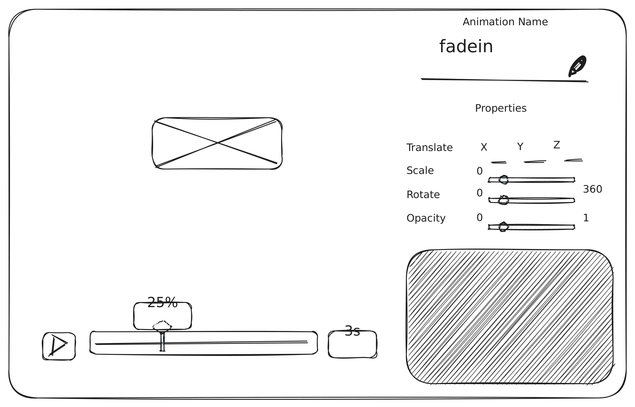
Mockups
It’s better to define the layout first, so I know where will place every part of the application based on the features defined above.

Once the layout is done, the next step is creation of the knobs. The first input is defined as the user shall be able to modify the animation name. Then each one of the properties might be defined the Blender way.

And last but not least the timeline is defined as follows. The tooltipe animation will show the user the current percentage of the animation from 0% to 100%. And, the seconds at the end will allow the user to see the preview as the final animation they will run.

The result will be something like this.
That’s it
Reach me on Twitter, if you got comments or questions about.